From Vue to Alpine.js: Our journey
Table of Contents
#The problem
We relaunched the e-commerce site from one of our clients in the end of 2019. It was a big relaunch, impacting the overall design, template and frontend architecture.
The only thing pretty much left unchanged was the backend.
The main goals defined with the client were:
- optimise PageSpeed metrics
- Improve usability and therefore conversion rate
After months of implementing, the client, and we, were happy with the results. We hit green ratings in all 4 of Lighthouse’s categories and the conversion rate improved significantly.
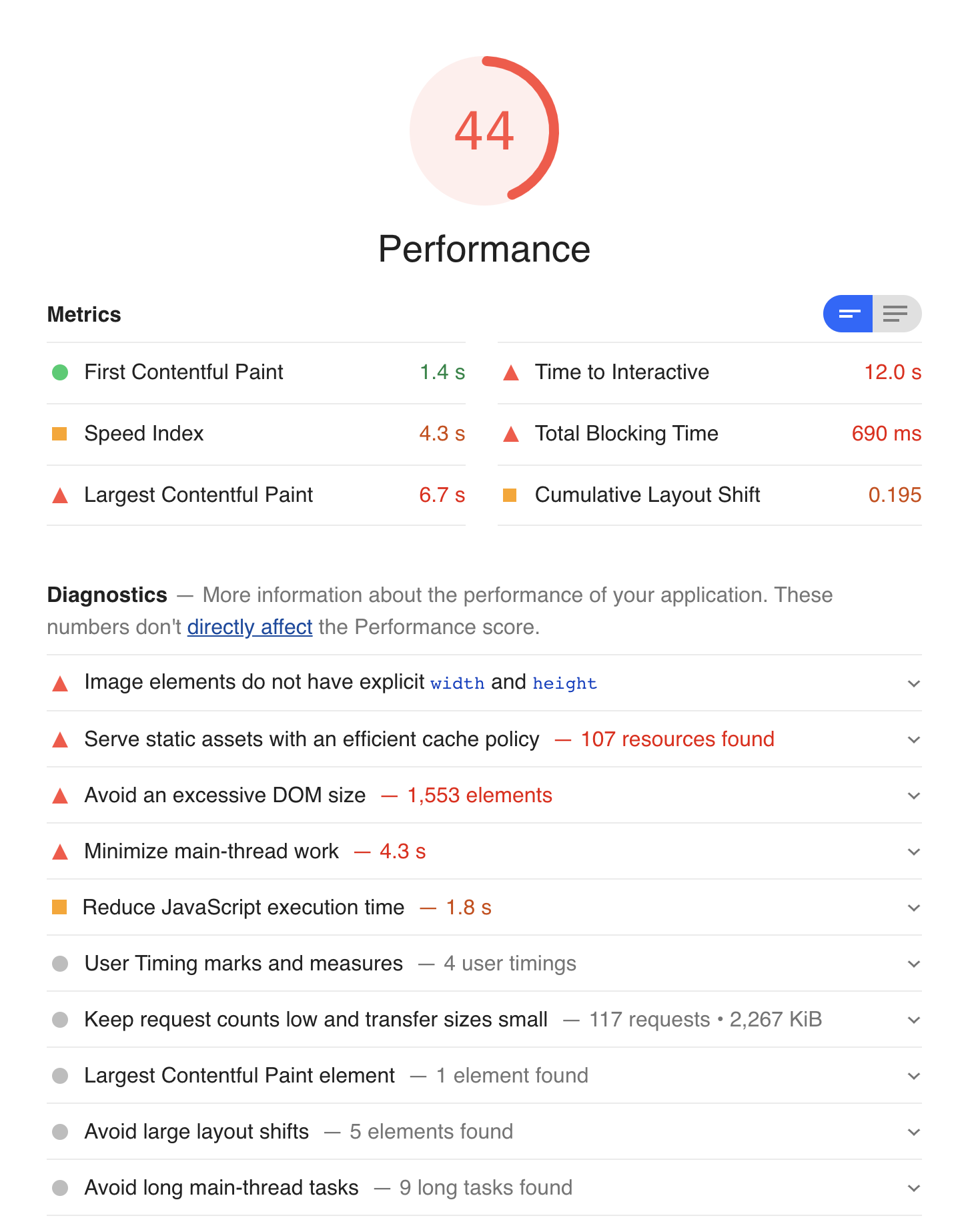
That was until Google decided to change how Lighthouse calculates the performance score (What’s New in Lighthouse 6.0). Our scores dropped from solid green ratings to red.
As a quick reminder: in addition to things like TTFB (Time to first byte) and overall network performance things like file sizes, optimised CSS or webfonts, Lighthouse moved the focus to frontend stuff like „Time To Interactive“ or „Largest Contentful Paint“. As the web becomes more and more interactive the perceived performance becomes more important. So, in theory, we agreed with Google’s step to include those new metrics. Although it’s comparing apples to oranges when Google presents nearly non-interactive sites like blogs as „good examples“.
After the first meetings with the client we postponed optimising for the new Lighthouse metrics. After analysing what devices our visitors most commonly used we couldn’t rationalise investing much time into a problem all our competitors faced also.
That changed with Google’s announcement that some of these new metrics would impact search ranking (Timing for bringing page experience to Google Search).
It was clear we shouldn’t postpone this issue further (this was late 2020 / early 2021).
We talked to the client again and decided we could gain a significant competitors advantage and of course perceived speed for the end users.
#How we analyzed
We now needed more data. To be frank: until this point the deeper performance metrics were never our biggest concern so we had some catching up to do.
Using Google Chrome we analysed the website with a mix of the built in Lighthouse app as well as the Performance tab in DevTools.
#Our setup at this time
When we did the relaunch we completely reimplemented the frontend architecture. We were using Vue 2 as our javascript framework of choice and TailwindCSS. Everything was bundled by Symfony Encore (Webpack).
The site was no SPA, instead we wrapped the whole site with a #app div which we bound the root instance to. We used renderless components (Renderless Components in Vue.js) so we could write most of our templates in Twig and also make easy use of server side variables without the need of writing an API.
<notepad-star
	:product-id="{{ product_id }}"
	:initial-star="{{ is_stared(product_id) ? 'true' : 'false' }}"
>
	<div>
		<button @click.prevent="toggle">Toggle</button>
	</div>
</notepad-star>
product_idis a server side variable andis_stared(product_id)a Twig functions. Both are passed into the Vue component as props.
#Analysing the problem
Our process looked like this:
- Do performance report in chrome
- Look at the numbers
- Change something
- Create new report to confirm or refute our assumption
The most significant part of the Performance Report was the „Evaluating scripts“ part. It seemed like the browser had a lot of work to do when evaluating our javascript bundle.

Live environment
Our first step was to comment out the script tag so see how that improved our metrics.
Turns out, pretty significantly:

Note: This report was generated in our development environment. We have a difference of about 10-15% to the live environment.
#What needed to be done
We identified the following things needed the most attention:
- Optimising preloading of key assets
- Minimising blocking time
- Optimising time to interactive
- Minimising main thread work
#Part 1: Optimising preloading
We experienced some render blocking because of quick and dirty implementations without proper performance testing for the Google Tag Manager and our CCM.
We tested different combinations of preloading and pre-connecting and ended up with the following results:
- Preload for key assets like the CCM script
- Preconnect for GTM
- Preloading of our own key assets (like webfonts or our main css/js file)
The following tools were used:
- Lighthouse: provides direct insight which assets should be preloaded
- Firefox: the devtools tell you which fonts you are preloading but aren‘t used within the first seconds
#Part 2-4: Optimising the rest
After we optimised the preloading we knew the only parts left that are impacting our key metrics could only be our own assets as in our javascript bundle.
All these metrics are somewhat connected to each other because of this.
#Finding the problem
Before optimising we first needed to understand the problem on a deeper level. As mentioned earlier we are using renderless components for all our Vue components and are wrapping our whole site with the Vue instance. This gives us the benefit of simple global state management. We can also simply sprinkle in some interaction by adding another mixin, for example:
export const searchOverlay = {
	data() {
		return {
			showSearchOverlay: false,
		}
	},
}
Example of global state / functionality provided by a mixin
#Different versions of Vue
Vue comes in two different „flavours“: the runtime-only-build and the one with included template compiler.
The runtime-only build is much smaller. It can only be used if you are using Single-File-Components. Those will be included in your bundle and therefore make
the template compiler unnecessary.
The template compiler enables us to provide templates from our templating engine (Twig) into the default slots of our renderless components.
But: because we were wrapping the complete site, Vue has to evaluate every DOM node it finds (around 4,500 nodes for the homepage).
That’s why we had such a long evaluate script time.
Now that we better understood the root cause we could start evaluating paths to mitigate this issue.
Unfortunately we couldn’t find a way to significantly improve the performance with our current architecture. There is just no good way to switch to the runtime-only build with our template architecture and backend structure.
#Evaluating the needs
Next, we put together the components and interactivity we currently provide on the site to get a bird’s eye view of the things we need from a new solution.
Here are some examples of components we have on the site:
- Live search
- Dynamic offcanvas cart
- A flyout menu
- Modals
We also have some smaller functions (previously provided by mixins). Those functions are mostly used for things that don‘t need a separate component because they hold little to no state but should be easily be triggerable from everywhere, like:
- Dynamically changing a product variant
- Opening the shipping modal
- Showing / hiding a global information banner
One thing all these things had in common: many of them needed to communicate with each other.
The components were not the most complex, mostly providing interactivity or preventing site reloads.
What we needed (and wanted) from a new framework was:
- Reactivity (templates rerender when data changes)
- Event system for easy communication between components
- Small footprint
#Enter Alpine.js
We already used Alpine.js in other projects to provide interactivity and really liked it. Since we were already using TailwindCSS, the claim “Like TailwindCSS for Javascript” really resonated with us.
We weren’t sure if Alpine.js could handle such a big e-commerce site. So our next step was to build a proof of concept to see if the hardest parts could be handled.
We rebuild the most important components like our offcanvas component, the dynamic cart and the main menu. These components used all the above mentioned needs. So if we could reintegrate these components we could be very confident that all other components could be rewritten also.
After about a day’s work we were super happy with the results. We hit a few roadblocks along the way, but since most of our logic is of course Javascript (although in Vue) the translation was very straight-forward for the most parts.
We settled on the following architecture:
js/
├── components/
│   ├── cart.js
│   ├── mobileMenu.js
│   └── ...
├── enums/
│   ├── events.js
│   └── ...
├── helper/
│   └── customEvent.js
├── providers/
│   ├── cart.js
│   ├── googleTagManager.js
│   └── ...
└── stores/
    ├── cart.js
    ├── global.js
    └── ...
components
Components are defined as window-scoped function which return an object to be used in Alpines x-data attribute to initialize a component.
This is a dumbed down example of our modal component, read on how we use the customEvent function and “enums”.
import customEvent from '@/helper/customEvent'
import { MODAL_OPEN, MODAL_OPENED, MODAL_CLOSE } from '@/enums/events'

window.modal = () => ({
	open: false,
	init() {
		if (this.instantDisplay !== undefined) {
			this.open = true
		}
	},
	close() {
		this.open = false
		customEvent(MODAL_CLOSE, this.name)
	},
	wrapper: {
		async [`@${MODAL_OPEN}.window`](e) {
			if (modalToOpen !== e.payload.name) {
				return
			}

			customEvent(MODAL_OPENED, this.name)
			this.open = true
		},
	},
})
enums
These are not really enums. It’s just a helper file which holds constants which we can use throughout the codebase without fear of breaking something when an event is renamed.
const MODAL_OPEN = 'modal-open'
const MODAL_OPENED = 'modal-opened'
const MODAL_CLOSE = 'modal-close'
helper
Helper functions which we can import from anywhere that hold no state.
This is what our customEvent helper looks like.
export default function (name, payload = null, originalEvent = null) {
	// options should be an object with:
	// name: 'string',
	// payload: 'object'
	// originalEvent: 'this', if you need the actual target that was clicked

	const customEvent = new CustomEvent(name, {
		detail: {
			payload: payload,
			originalEvent: originalEvent,
		},
	})

	window.dispatchEvent(customEvent)
}
This little helper gives us a lot of flexibility and we use it from anywhere (directly in the HTML for example) without the need of defining countless Alpine components.
This just uses the standard CustomEvent API under the hood
We made the function available in the window-scope so we can just use it in an onclick attribute:
<button type="button" onclick="customEvent('name', 'payload')"></button>
providers
Providers provide reusable functionality to provide data. Think of it as the client side API layer. As with the helper functions these functions should hold no state and just be consumed by our components.
This is what the provider for the live search roughly looks like:
import customEvent from '@/helper/customEvent'
import { SEARCH_GET } from '@/enums/events'

async function getResultFor(searchTerm) {
	let result = undefined

	await fetch(`/search?q=${searchTerm}`)
		.then((response) => response.json())
		.then((data) => {
			result = data
		})

	customEvent(SEARCH_GET, result)

	return result
}

export { getResultFor }
stores
Since we depend on Alpine.js 2.8 we use Spruce for global state management.
We have one store for each part, these are the few lines of code we use to manage the state of our mega menu:
Spruce.store('megamenu', {
	activeId: null,
	toggle(id) {
		if (id === this.activeId) {
			this.activeId = null
			return
		}
		this.activeId = id
	},
})
#Comparison between old and new metrics
After having settled on an architecture and implementing our most complex components without problems we were very confident we are on the right path. The metrics looked promising, gaining 15-20 percentage points in most performance categories.
We were eager to get complete metrics after implementing all other components. My heart-rate elevated a little when I pressed “Generate Report” in the Lighthouse tab.
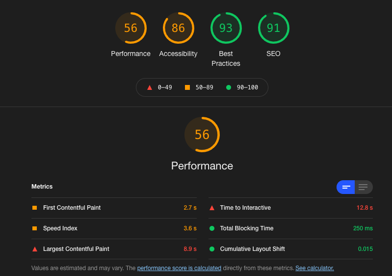
We expected we wouldn’t come to the 56 points completely without scripts, but here we are:

This again was our dev environment, thus many opportunities shown here wouldn’t apply in the live environment.
Pleased with the results we did some final tests, cleaned up the code and planned the release for the next Monday.
The “Merge”-Button was pressed at 8:24AM. We did a last Lighthouse test before, our performance-score was down to 28 at that time (I don’t exactly know what caused the drop of around 10 points).
Deployment rolled through. The site still worked. And we scheduled another Lighthouse test.
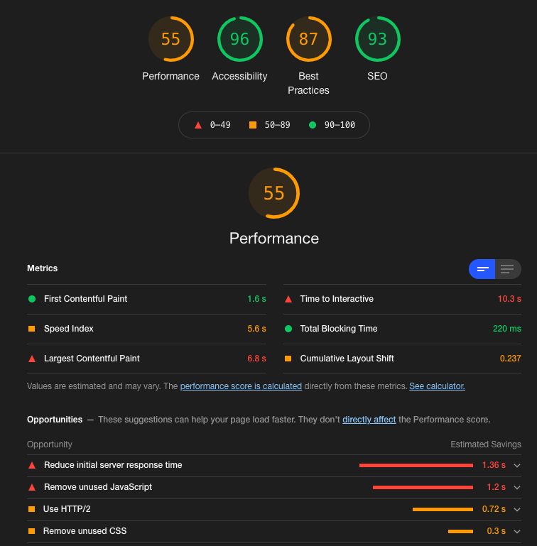
I’ll let the result speak for itself:

After Go-Live we noticed a few small things we optimized the following days, landing us a solid score of 62 in the end.
What a ride!
This won’t be the end of our journey, though. We now laid the groundwork to further improvide the page experience for the users.
#Honorable mention: Debugbear
While doing all this we noticed we needed some kind of monitoring of our metrics.
While researching ways to accomplish this with our CI/CD pipeline, through manual tests or a script running the Lighthouse Node CLI we stumbled upon Debugbear.
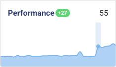
Debugbear is a service which monitors your core web vitals, does Lighthouse tests and can compare all of these results to either your competitors or your historical data, providing great insights into what changed between two tests.
Debugbear helped us not only in better understanding what caused problems, but also in having confidence into our optimizations.
Debugbear provides great value for its dollars. And Matt is a great guy, we had problems with our credit card, he generously renewed our trial multiple times so we could continue to test everything without having to fear the deadline.
#Final words
This concludes the first part of our journey.
The results are great and we are confident in our decision. Vue just wasn’t the right fit for a project of this kind and honestly: the decision to use Vue like this might have seemed like it was a good one a few years back, but it never was.
This was totally our fault. Vue is a great framework and we still use it. But we now have another great tool in our belt which may be better suited than Vue.
You might find these related articles helpful or interesting, make sure to check them out!
I hope you found this article useful! 😊.